Navigation is the part of an interface users notice only when it fails. When it works, they move through a product without thinking about it; when it does not, every task feels like wayfinding in an unfamiliar building. A well-structured navigation system helps people find what they need quickly and confidently, and it is one of the highest-leverage things you can get right early. Here is the approach we use when building Blazor applications with the ConnectSoft Blazor UIKit.
Start with information architecture, not menus
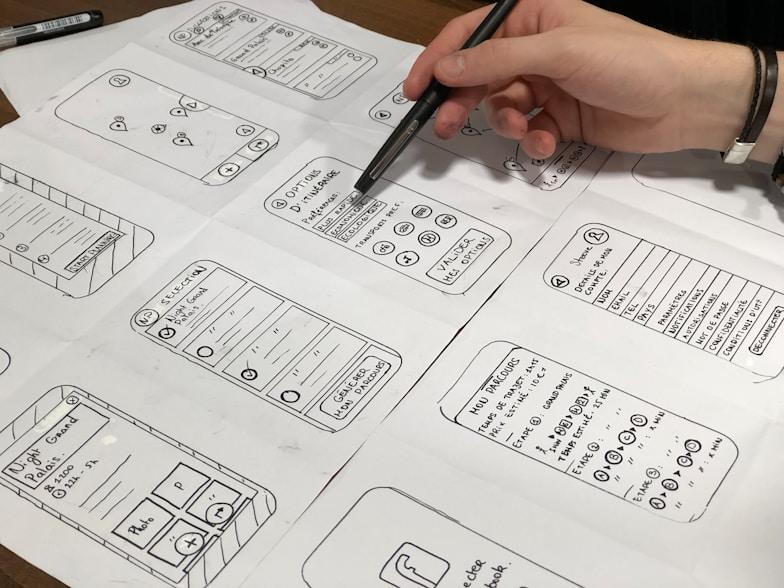
The most common navigation mistake is designing the menu before understanding the content. Navigation is a view onto your information architecture (IA), so the IA has to come first.
- Inventory the content and tasks. List everything users need to reach and every job they come to do. Group related items together based on how users think, not how your database is structured.
- Name groups in the user's language. Labels should match the words your audience uses. "Billing" beats "Monetization Service"; "Reports" beats "Analytics Engine."
- Keep the hierarchy shallow. Most products are well served by two levels. If you need a third, that is a signal to reconsider the grouping.
Good IA makes the menu almost design itself. Bad IA cannot be rescued by a prettier menu.
Choose the right navigation pattern
Different products call for different primary patterns. Pick deliberately:
- Top bar - best for marketing sites and products with a small number of top-level destinations. It is scannable and familiar.
- Sidebar - best for application-style products with many sections, settings, and tools. It scales to more items and supports grouping.
- Combination - a top bar for global actions (account, search, help) plus a sidebar for the app's sections is a reliable pattern for richer products.
Whatever you choose, the ConnectSoft Blazor UIKit gives you composable building blocks - nav bars, sidebars, menus, breadcrumbs - so you assemble a consistent, themeable navigation instead of hand-rolling one per project.
Make the current location obvious
Users should always be able to answer two questions: "Where am I?" and "How do I get back?" Two patterns cover most of this:
- Active state. The current section must be visually distinct - not a subtle shade difference, but a clear highlight. In Blazor,
NavLinkwithNavLinkMatchresolves the active route for you; pair it with a strong active style from your design tokens. - Breadcrumbs. For anything more than two levels deep, breadcrumbs show the path and give a one-click way back up. They are cheap to add and dramatically reduce that "lost" feeling.
Reduce choices, not capabilities
A menu with thirty items is not powerful, it is paralyzing. The goal is to reduce the number of decisions at each step without hiding what the product can do.
- Prioritize ruthlessly. Promote the few destinations most people need; demote the rest into secondary navigation or in-context entry points.
- Use progressive disclosure. Reveal advanced options when they are relevant rather than showing everything at once.
- Group with intent. Sections and dividers help users scan; a wall of equally weighted links does not.
Design for mobile and touch
Navigation that works on a wide screen often collapses badly on a phone. Plan for it:
- Provide a clear, reachable menu toggle and make sure the open/close state is obvious.
- Make targets large enough for thumbs and spaced so users do not mis-tap.
- Preserve the active state and hierarchy in the collapsed view - do not flatten everything into an undifferentiated list.
Do not skip accessibility
Accessible navigation is better navigation for everyone, and it is not optional.
- Semantics. Use a real
<nav>landmark and lists for groups of links so assistive technology can announce structure. - Keyboard. Every item must be reachable and operable by keyboard, with a visible focus indicator. Add a "skip to content" link so keyboard users can bypass the menu.
- Labels and state. Use
aria-currentfor the active item and meaningfularia-labels on icon-only controls.
The UIKit components ship with these behaviors built in, which is precisely why we reuse them instead of re-implementing navigation on each engagement.
Measure, then refine
Navigation is never "done" - it is a hypothesis about how people will move through your product. Validate it.
- Watch real users attempt real tasks; note where they hesitate or backtrack.
- Look at analytics for menu items that are never used or pages reached only through search - both are IA smells.
- Iterate on labels and grouping. Small wording changes often produce outsized improvements.
The short version
Great navigation comes from clear information architecture, the right pattern for your product, an obvious sense of place, restraint in the number of choices, mobile and accessibility built in from the start, and a willingness to refine based on real behavior. Build it on consistent, accessible components - like the ConnectSoft Blazor UIKit - and navigation becomes the quiet system that lets users focus on their work instead of on finding their way.